These short case studies highlight practical ways I use AI tools to support research, analysis, communication, and decision-making. Rather than replacing human judgment, these tools help me reduce manual effort, move faster through early exploration, and focus more time on synthesis, strategy, and execution.
Summarizing user research interview transcripts
Tools: Microsoft Copilot, Claude
I have used Microsoft Copilot and Claude to help analyze usability interview transcripts. The AI anonymized transcripts (using “Interviewer” and “Participant” instead of names) and summarized each question and response while preserving the interview structure. This removed filler words, repetition, and small talk, making the transcripts significantly faster to review.
I then fed the cleaned transcripts back into the AI and asked synthesis questions, such as “What did the participant say about the images on the website?” These prompts allowed the AI to pull insights across multiple responses. I also requested direct quotes for reporting, which helped speed up stakeholder-ready summaries.
Drafting emails and messages
Tools: Claude, ChatGPT
These tools are effective at turning informal notes into structured messages. I often start with a rough, conversational draft and ask the AI to rewrite it in a more concise or executive tone. This helps tighten language, clarify intent, and reduce time spent polishing routine communication.
Exploring new areas of expertise
Tools: Claude, ChatGPT
When starting work in an unfamiliar domain, I use AI tools to quickly build foundational understanding. For example, I asked Claude to explain SEO considerations for LLM-based search, including concepts like schema, GEO, and how these overlap with traditional SEO practices.
I’ve also used AI to learn the basics of deal registration and bidding in sales contexts. When possible, I ask the tools to cite sources so I can validate information against trusted references, helping me get up to speed without hours of unstructured searching.
Image generation for user personas
Tools: Miro AI
AI image generation is useful for quickly creating persona portraits. I can specify clothing color to visually group or color-code personas, and generating images is faster and more flexible than searching stock photo libraries.
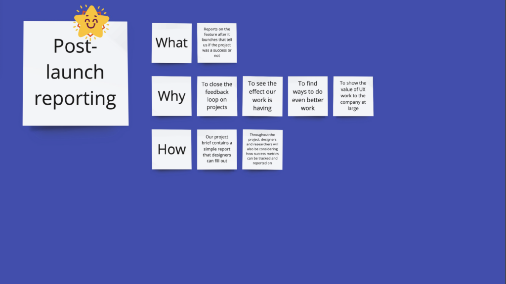
Creating draft research plans, surveys, and interview scripts
Tools: Claude
Claude can generate an initial research plan based on unstructured notes, providing a useful scaffold when no template exists. I’ve also used it to expand draft interview questions into full scripts, including introductions, instructions, and contextual explanations for participants.
This approach speeds up early drafting and allows me to focus my time on refinement.
Finding websites associated with properties owned by a management company
Tools: Microsoft Copilot
To identify stand-alone websites for properties owned by a specific property management company, I used Copilot to generate lists of potential URLs. While the results were not always accurate, the process was faster than manual searching.
Copilot provided a list of clickable links that I could quickly validate, reducing overall time spent gathering the information.
Analyzing the audience for a website
Tools: ChatGPT
I provided ChatGPT with websites from different property management companies and asked it to assess who the homepage content appeared to be targeting. The tool was able to accurately summarize likely audiences and identify whether shopper-focused content was present.
Importantly, it explained which elements it used for its assessment, allowing me to evaluate whether those elements really supported shopper needs or were being interpreted incorrectly by the AI (e.g., property listings that were not actually designed for shoppers).
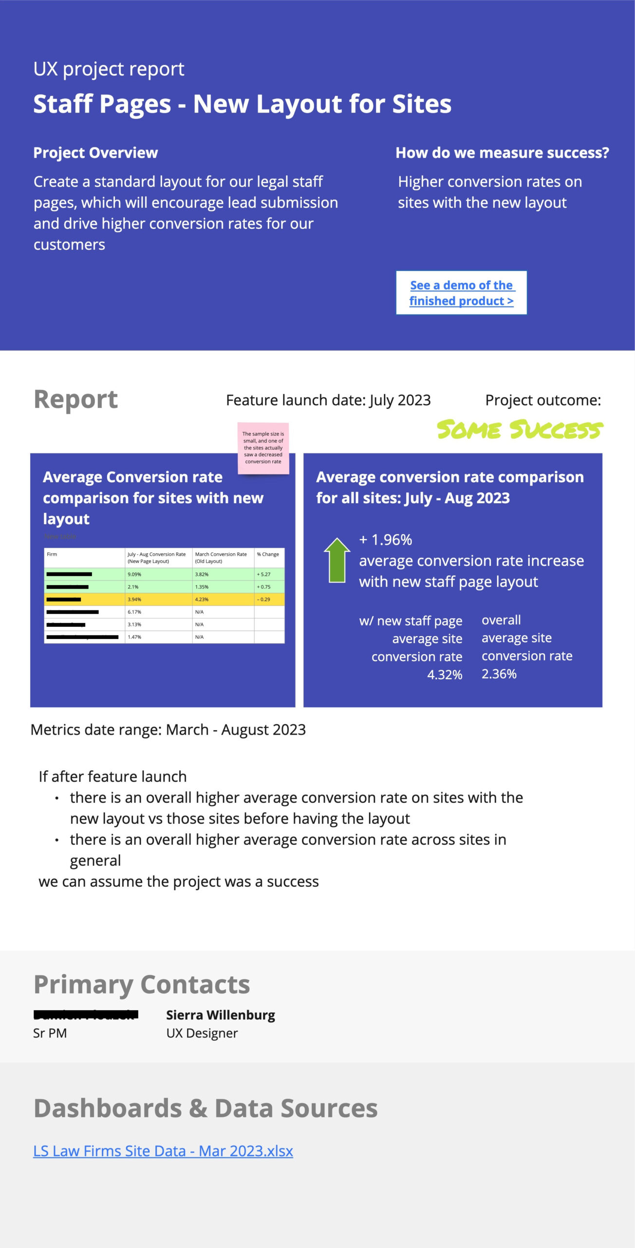
Generating realistic dummy content for mockups and wireframes
Tools: Claude
While designing a marketing dashboard, I needed realistic placeholder content related to joint business plans and marketing development funds. Claude generated a sample report that reflected the type of data the dashboard would contain.
This saved time on research and brainstorming and allowed me to focus on design using context-appropriate content.
Evaluating portfolio case studies for a new career focus
Tools: ChatGPT
When transitioning from UX to Project Management, I used ChatGPT to evaluate my existing portfolio and case studies and identify how they could be reframed through a project management lens. Based on the content I provided, it rewrote sections to emphasize leadership, planning, decision-making, and outcomes rather than design artifacts.
I instructed the AI to ask clarifying questions where information was missing, which prevented fabrication and allowed me to expand on aspects of the work that hadn’t been highlighted in my original UX-focused case studies.